

The Beach Bum Application
UX Case Study
Design Project

The Story
I was challenged to research, design, and create a wave and weather forecasting app for beach lovers around the world.
Problem Statement
"Beach lovers and water sport aficionados need a reliable, quick, and easy way to check beach weather conditions, because they want to plan time at the beach effectively, safely, and have fun."
Methods
- Competitive Analysis
- User Interviews
- User Personas
- Affinity Mapping
- Paper Prototyping
- Usability Testing
- Preference Testing
- Card Sorting
- Wireframing
- Mockups
- Prototyping
Tools
- Adobe XD
- Adobe InDesign
- Adobe Photoshop
- Adobe Illustrator
- Usability Hub
- InVision
- YouTube
Design Thinking Process Used

01. Research
Competitive Analysis
To better understand the current environment, a competitive analysis and UX analysis were conducted on two existing apps, Surfline and Magicseaweed.
Key Takeaway: Current existing beach weather apps are complex and lacking in simplicity for users to easily understand.
View full Competitive Analyses & UX Analysis here.
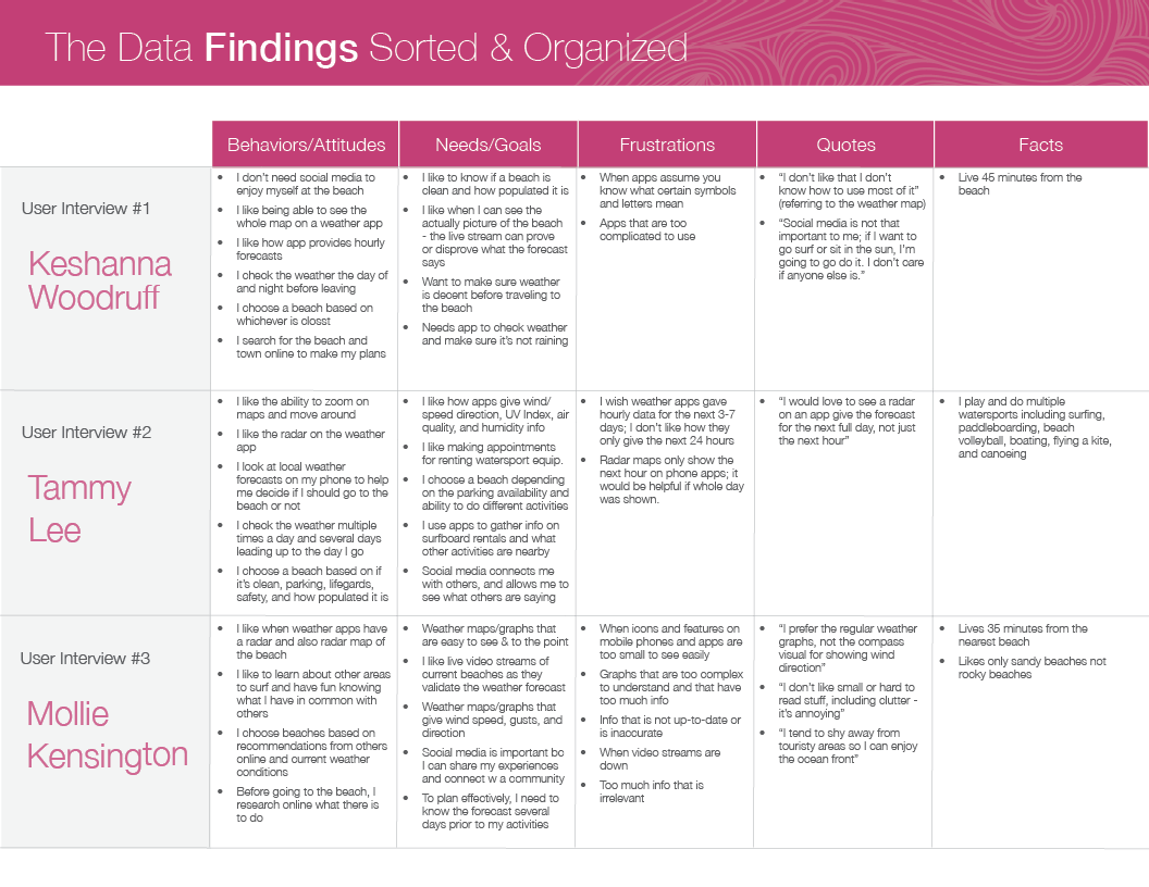
02. User Interviews
Interview Script, User Interviews, & Results
To better understand our users and target audience, user interviews were conducted. These will help identify confusing or problematic functions of similar existing apps, designs users currently enjoy, and techniques that can be used to overcome obstacles.
Key Takeaways: Users choose beaches based on several factors including weather forecast, cleanliness, proximity, busyness, sand quality (sandy or rocky), water sport rentals, parking availability, things to do, and if lifeguards are present.
View the User Interview Script, Interviews & Results here.

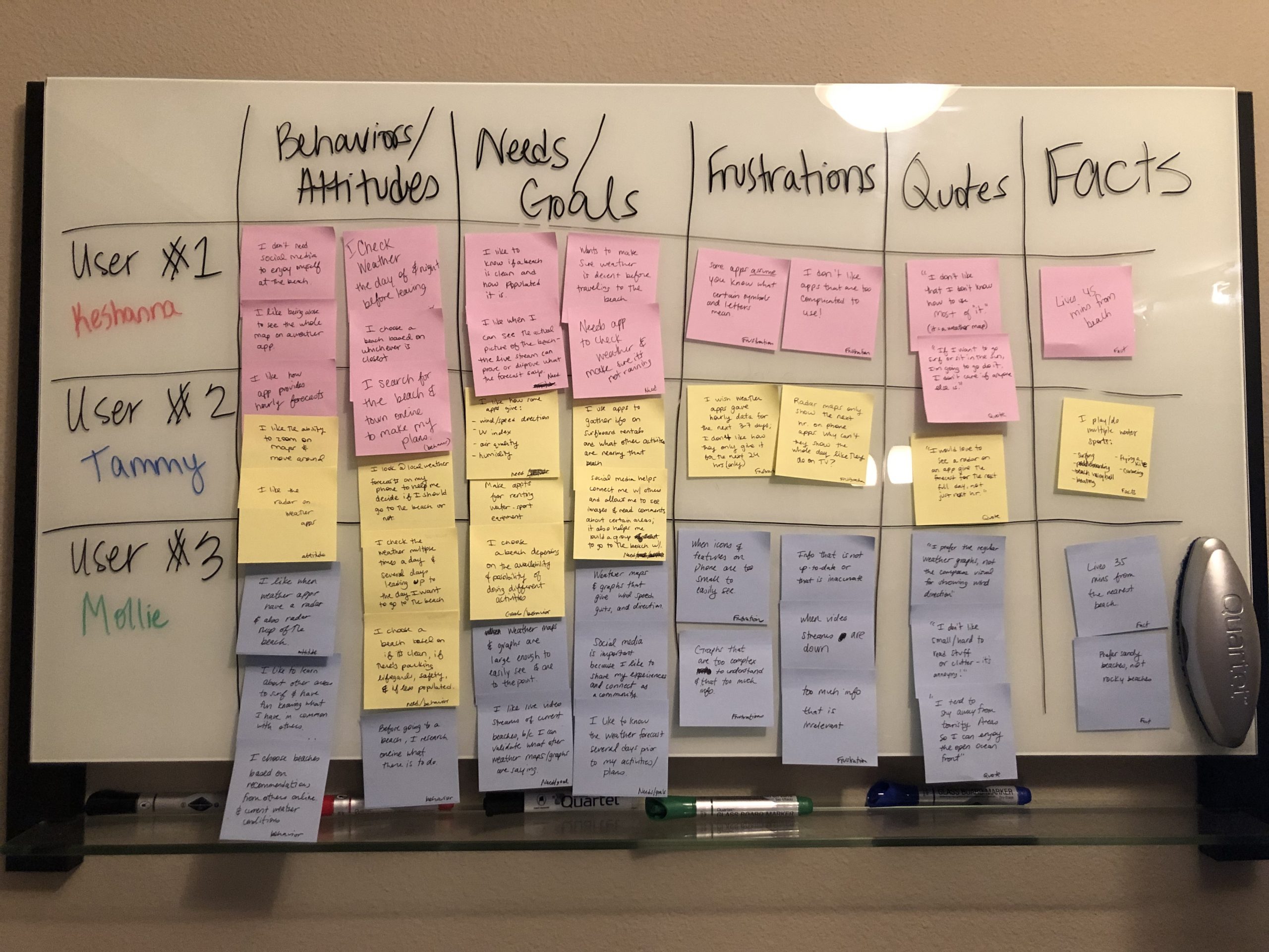
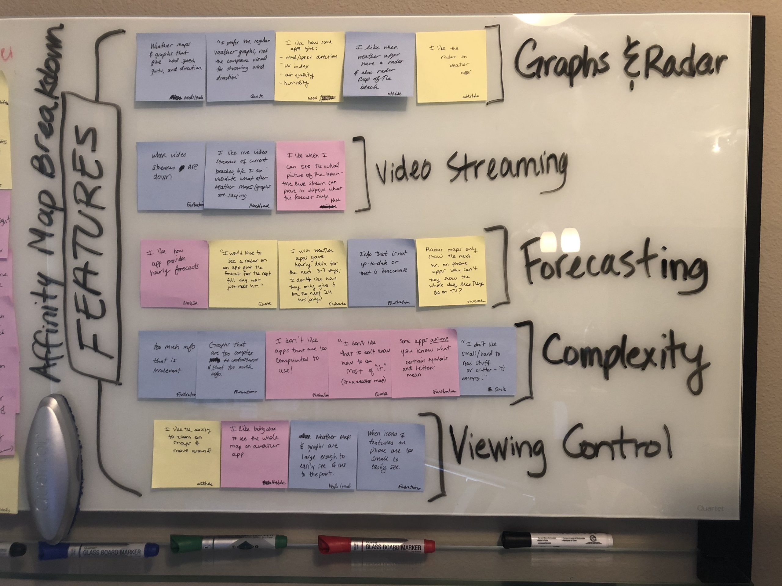
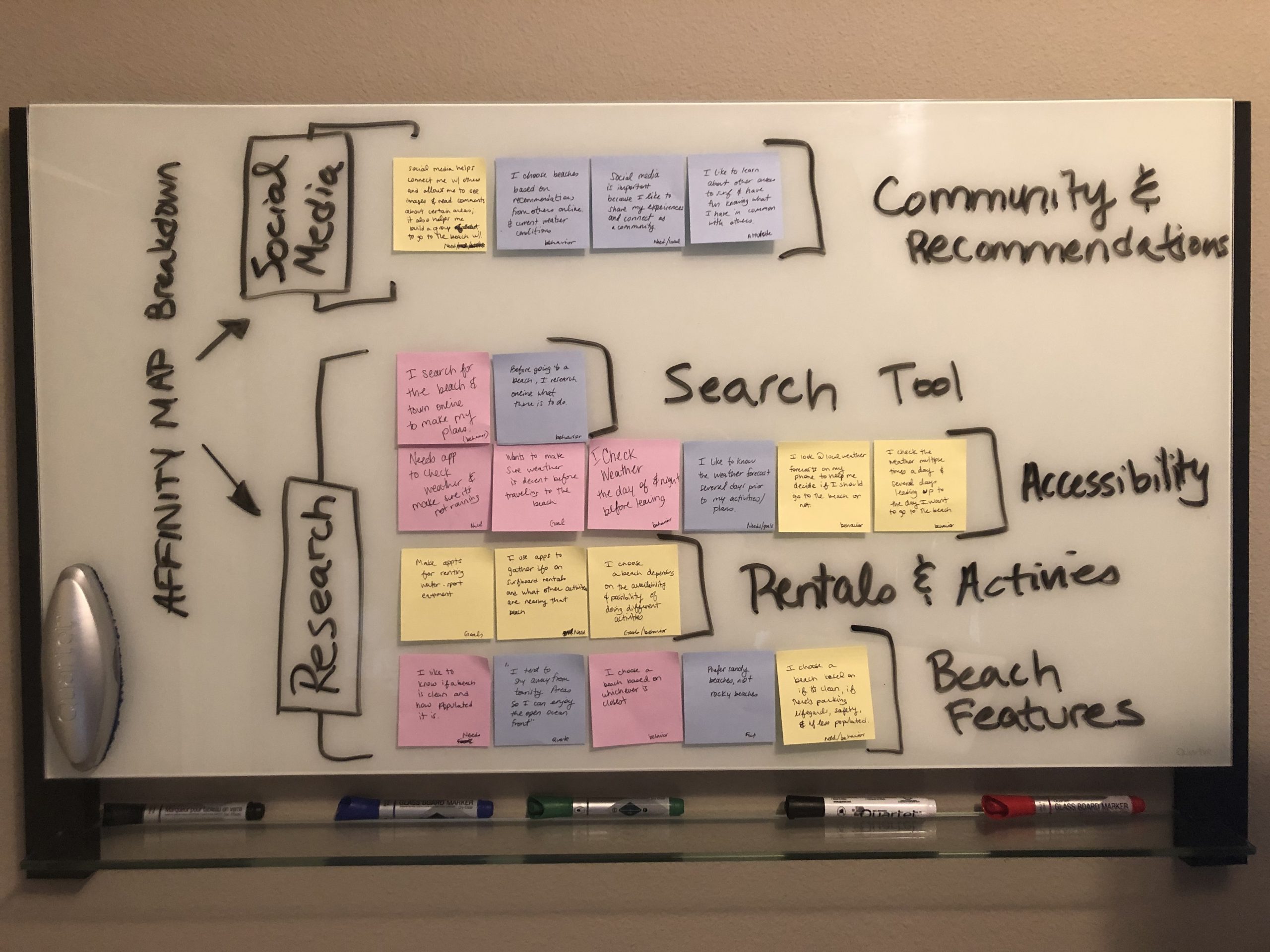
03. Analyzing the Data
Affinity Map
In order to fully analyze the data and results of the interviews, I created an affinity map. This helped identify patterns and categorize information, ultimately uncovering several key insights within the data.
Key Takeaways: Users are looking for straight-forward weather graphs, extended forecasts, easy search capabilities, live video streaming, and a key to help new users understand how to read various weather graphs and information.
View full Analysis and Affinity Map here.
04. Storytelling
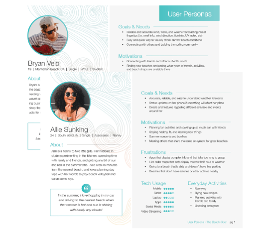
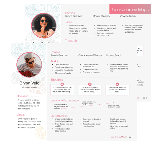
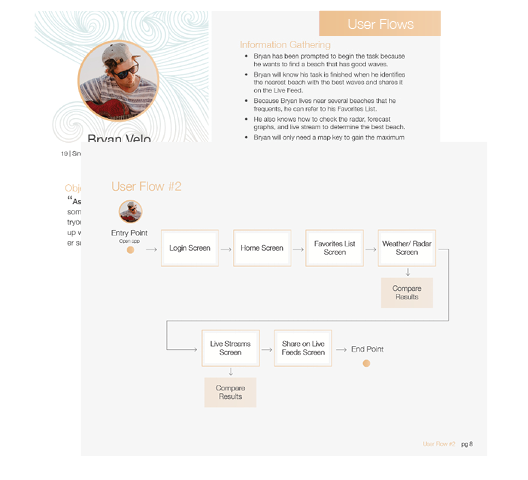
User Personas, Journeys, & User Flows
With a clearer understanding of our users' motivations, behaviors and needs, user personas were created, along with user journey maps to visualize how a user would accomplish a goal. Lastly, user flows were created to show how a user will navigate through the app to complete a task, from beginning to end. This helped us focus on the flow of the app versus separate screens.
View User Personas, Journey Maps, and User Flows here.

05. Information Architecture
Sitemap and Card Sorting
Now that we understand our target audience and how they will accomplish specific tasks, we created a sitemap and verified it by conducting an open card sort exercise.
Key Takeaway: Beach Pictures and Beach Details (rentals, nearby surroundings, etc) were updated to be grouped together. Initially, pictures were placed alongside video streaming. However, the card sorting helped show that users actually grouped beach pictures with details about the beach.
View Sitemap & Card Sorting Results here.
06. Wireframes
Sketches and Wireframes
With the navigation more clearly defined, we created wireframes. First, sketches were created to help quickly generate ideas for the layout. Then low-fidelity wireframes were created to show a basic design layout, followed by mid-fidelity wireframes demonstrating placement of UI elements. Finally, high-fidelity wireframes were created to show the exact placement, shading, and use of real text.
Key Takeaway: Creating sketches and wireframes is one of my most favorite parts to do in the UX process. Sketching with paper and pencil allows the ideas and creativity to flow without restrictions - such a fun and freeing feeling!
View Sketches, Wireframes, & Paper Prototypes here.


07. Usability Testing
Usability Testing
To test the design, the high-fidelity wireframes were converted into a clickable prototype and using InVision. Doing this was a quick and inexpensive way to test the initial product, and offered maximum learning with minimal effort.
Key Takeaway: Results showed that the Home, News, Notifications, and Share icon needed to be updated as they were not universally recognizable. Also, the search function needed to be improved to enable searching by not only "region", but country, state, city, zip, distance, or name.
View full Usability Testing & Results here.
08. Visual Design
Design Language System
To ensure Beach Bum's design and user experience is consistent across multiple platforms and devices going forward, a design language system was created.
Key Takeaway: Creating a style guide can be fun but overwhelming. I found it important to remember to keep it simple, so it could be used as a quick and clear reference point for future questions regarding the design and branding of Beach Bum.
View the Design Language System here.


09. Final Prototype
Beach Bum: the beach weather app
The final mockup screens for Beach Bum were created using Adobe XD. The final screens were then made into an interactive prototype using InVision, and a video tutorial using YouTube. Check out the final prototype below, or view the video tutorial here.
10. Retrospective
The intent of this tool was to design an application that beach lovers could quickly and easily use to check the wave and weather forecast of beaches near and far. My biggest challenge was identifying how to make wave, weather, and radar information easy to understand by all users. Creating a simple and easy-to-understand app was a key factor in differentiating Beach Bum from other existing weather apps, which were more complex and difficult to understand. Beach Bum was created not only for those who go out on the water, but those who hang on the beach and enjoy the sun. The beachside people were not as familiar with certain forecast and radar features.
As a result, I added self-help icons to enable beachside users to quickly understand what particular weather features meant. Also, features that were commonly referenced by both parties (e.g. temperature, humidity, current weather, etc.) were increased in size and placed at the top of their respective screens in the app. Doing this made the app easier and quicker to reference, improved readability, and ensured understanding by all users.
Moving forward, I will make sure to do additional research on topics that I may not be as familiar with. While building out Beach Bum, I realized my own knowledge was lacking in this very field above waves, weather, and radar information. This made it more difficult to design potential features and know how to create an appropriate layout. Having a deeper understanding of what you are building can help improve the overall design and creative process of creating a successful tool and interface.