

USPTO Kids
A website redesign and overhaul
Design Project
The Story
I was challenged to create an entire redesign of the USPTO's Kids website. The objective was to create a simple, modern, and fully responsive website that provided kids, educators, and parents with an engaging and educational experience. It's goal was to introduce the difficult concept of Intellectual Property in an engaging manner and to inspire creativity and innovation in our next generation of kids!
Methods
- Competitive Analysis
- Content Analysis
- User Interviews
- Preference Testing
- Wireframing
- Mockups
- Prototyping
Tools
- Axure
- Adobe Photoshop
- Adobe Illustrator
- Microsoft Excel
- Microsoft Word
Problem Statement
The current website was not responsive, contained outdated graphics and documents, was difficult to maintain and update, and was not consistent with the USPTO Design System.
01. Research
Competitive Analysis
To better understand the current environment, a competitive analysis was performed. This helped identify what other kid sites regarding creativity and innovation were out there. For example, how were they introducing topics and engaging their audiences? What were common themes on their sites or were there any? What were their chosen use of colors and why? Were they using re-usable web templates or components on their pages?
Several key takeaways: Yellow and orange were the dominantly used colors among websites expressing innovation and creativity for kids, other bold colors accented those as well (i.e. dark grays, purple, and bright blue). Additionally, fonts were large, sites were graphically heavy, included animation, navigation was simple, and topics were expressed and introduced indirectly. In other words, topics were not boldly defined - they were often introduced in fun around-about ways making it more fun and engaging.
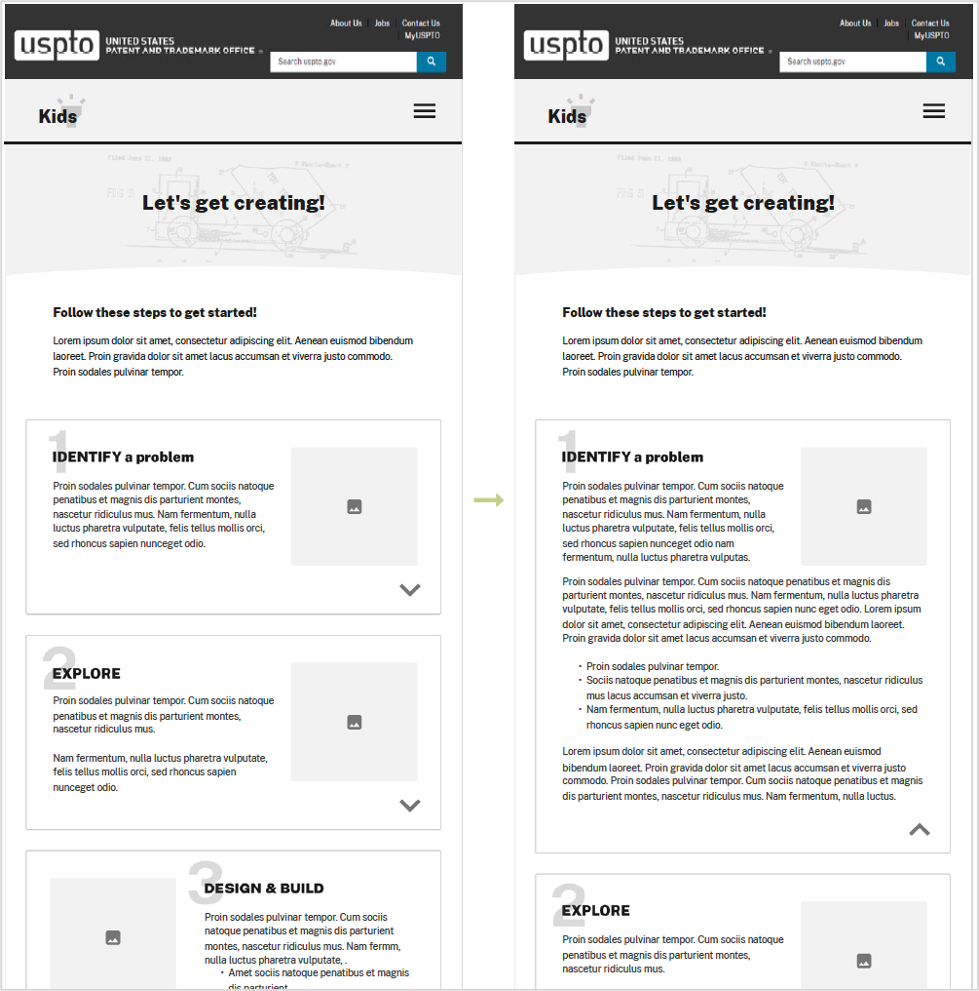
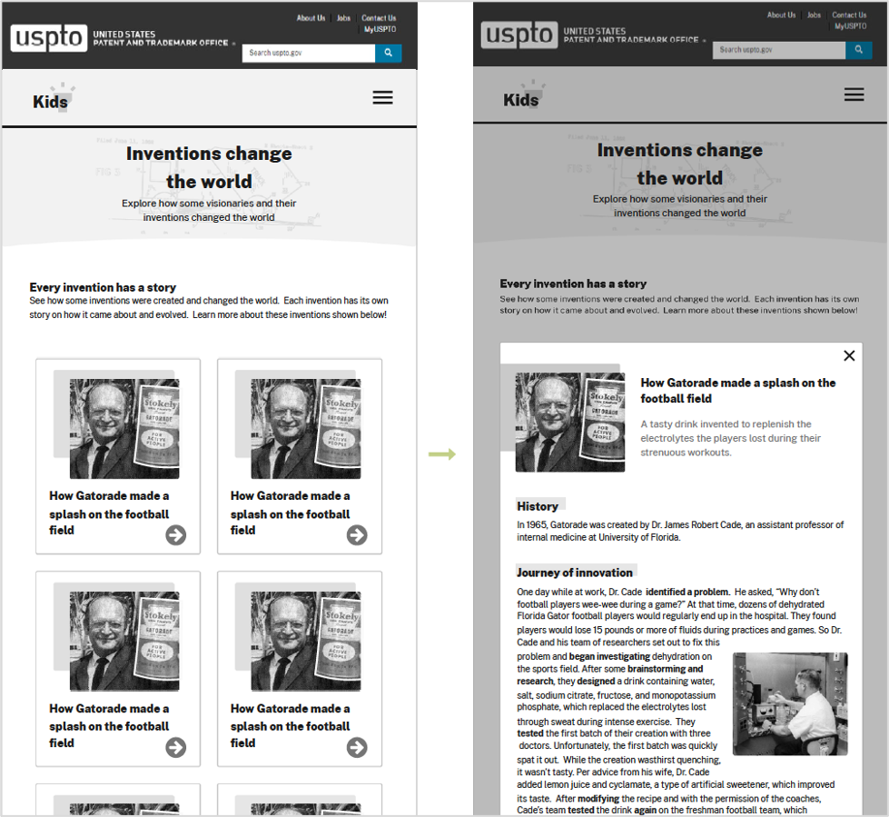
02. Design
Wireframes & Mockups
In order to establish a design, I took into account the content we were designing for and began sketching to help generate ideas. I created low-fidelity wireframes to show a basic skeleton of the design, then met with stakeholders and received feedback on the design. Iterated multiple times refining the design, then created a high fidelity mock-up to demonstrate placement, colors, and details of components.
Key Takeaway: These designs were the actual initial designs that sparked the fruition and design of the new USPTO Kids website!
View an example of the USPTO Kids wireframe and hi-fi mockup here.


03. Technical Specifications
Component Specs & Responsive Views
To ensure the developers could build and develop the reusable and responsive components efficiently, accurately, and consistent with USPTO's design system (to create a flexible template), I created this detailed spec document that included but isn't limited to: color, spacing, font, text sizes, expected interactivity, responsive views, breakpoints, and links to other helpful docs for reference.
Key Takeaway: Creating a spec document helped support the developers and I (the designer) as it was a quick go-to reference point for verifying and clarifying design questions and ensured consistency.
View the full Technical Design Specs here.
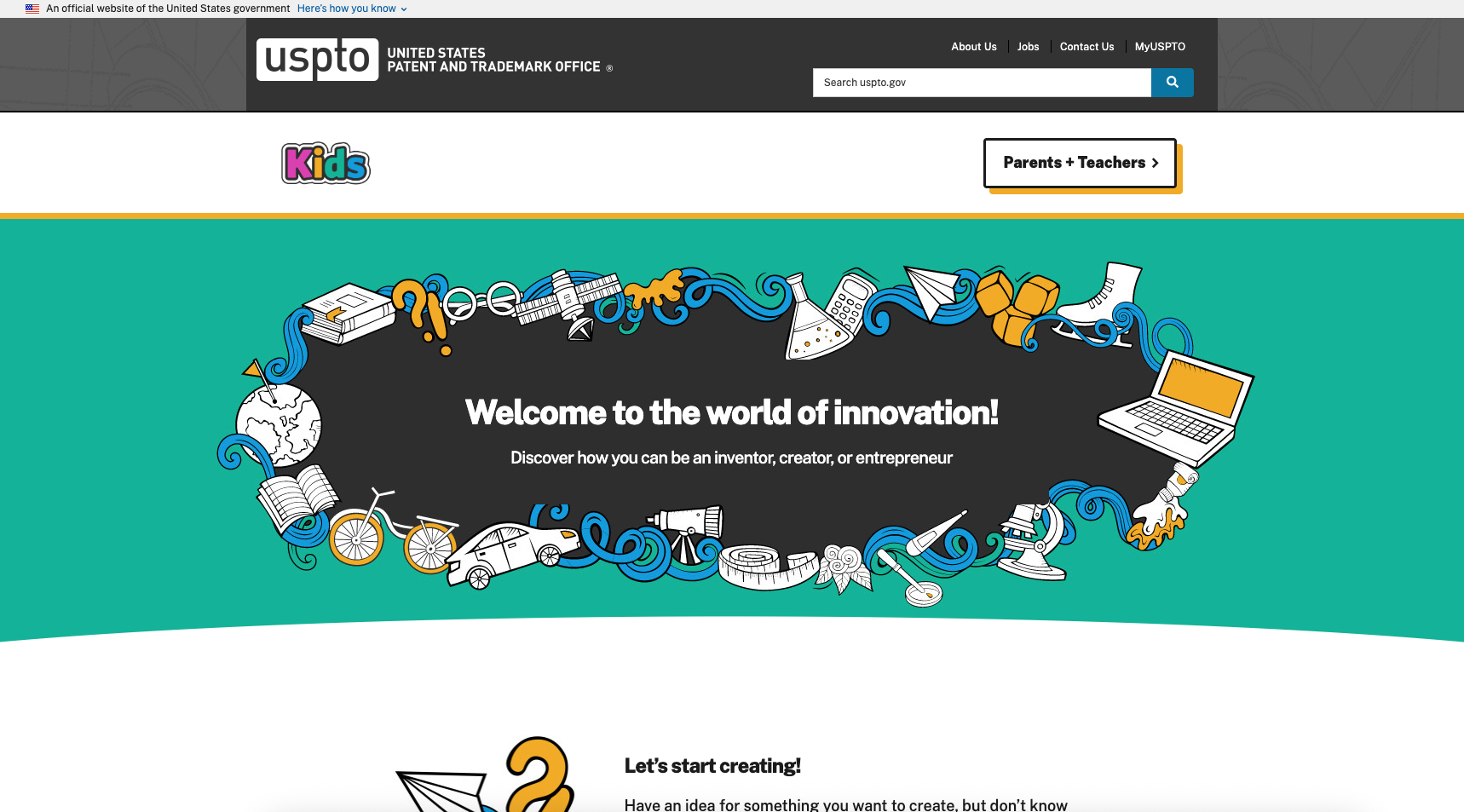
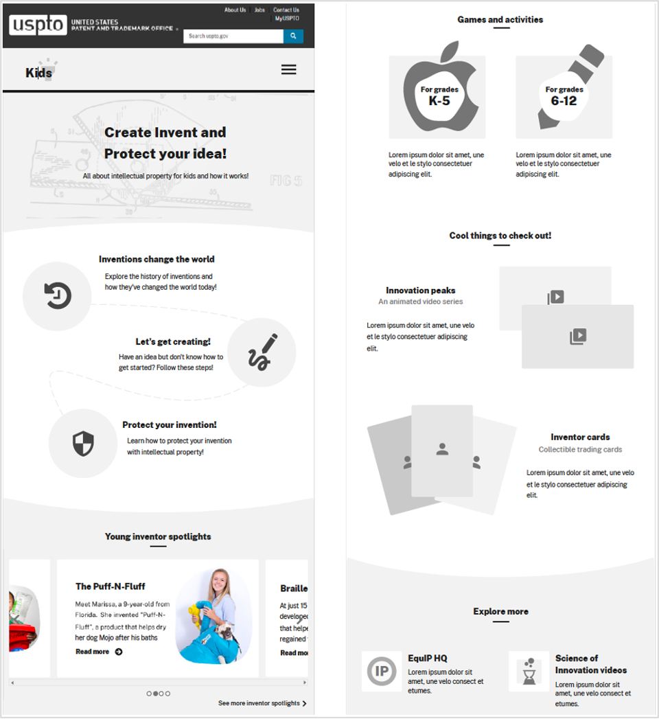
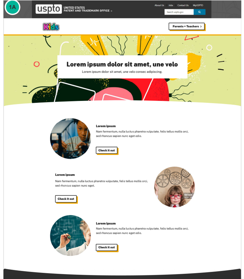
'04. Final Responsive Design
USPTO Kids Website
The final design provides a modern, fun, engaging and educational website for kids, educators, and parents. The responsive website can be viewed below on the United States Patent and Trademark Office's website. You can also view the release bulletin here.

05. Summary & Retrospective
This project was a lot of fun as it entailed a different user base (kids!) than the typical USPTO users. Knowing this, it was important the design be be bright, fun, and engaging -- and very tablet and mobile friendly. Kids and educators heavily use tablets, ensured the designs incorporated multiple fun and engaging ways to tap, scroll, and navigate through the website easily.
One of the biggest challenges I faced was ensuring the design was reusable to create other webpage templates. Management was looking to have one 'flexible' template with multiple reusable components, to easily create and build other webpages for kid's. The way in which this was accomplished was first creating a design around the existing and expected content. Once several webpages were mocked-up, I analyzed the design and identified what could become 'reusable' components. You might be wondering - why didn't you just create the components first? Well, I found it challenging to design components when there was no design yet established, which I felt could be risky and disrupt the 'to-be' design, user experience, and page flow. Therefore, creating a web design mock-up first helped ensure the future components and page design would fit and flow seamlessly together, as well as yield a fun and pleasant user experience.
Once the final design was agreed upon by all parties, I detailed all components in a spec document including details about their interactivity, responsiveness, color options, accessibility, sizing, breakpoints, text, character counts, etc.., and provided it to the developers who built the components and brought this web design to life.
In conclusion, the website received many kudos rom management and users. According to GA metrics and comparing October 2024 to October 2025, monthly page views increased by ~4.4%, bounce rate decreased by ~4.2%, and average session duration increased ~18%.